


Bitcoin's Money Map
A Dive into Purchase Patterns and Trends

Hello Bitcoin Team,
Ever wondered where and when people buy their Bitcoin? This week, let's zoom in on that! We've got a cool chart that paints a picture of when people jumped into the Bitcoin game and at what price, by breaking down the percentage of Bitcoin’s supply accumulated at various price levels. Here's an insight-packed overview, yet bear in mind, that with on-chain analysis being such a new field, our journey into deciphering this perspective is ongoing. Rest assured, as further insights emerge, they'll land straight in your inbox.
Let's kickstart by taking a close look at our current supply distribution, followed by a retrospective glance over the past 6 months – showcasing how the distribution has evolved.
Bitcoin On-chain Supply Distribution
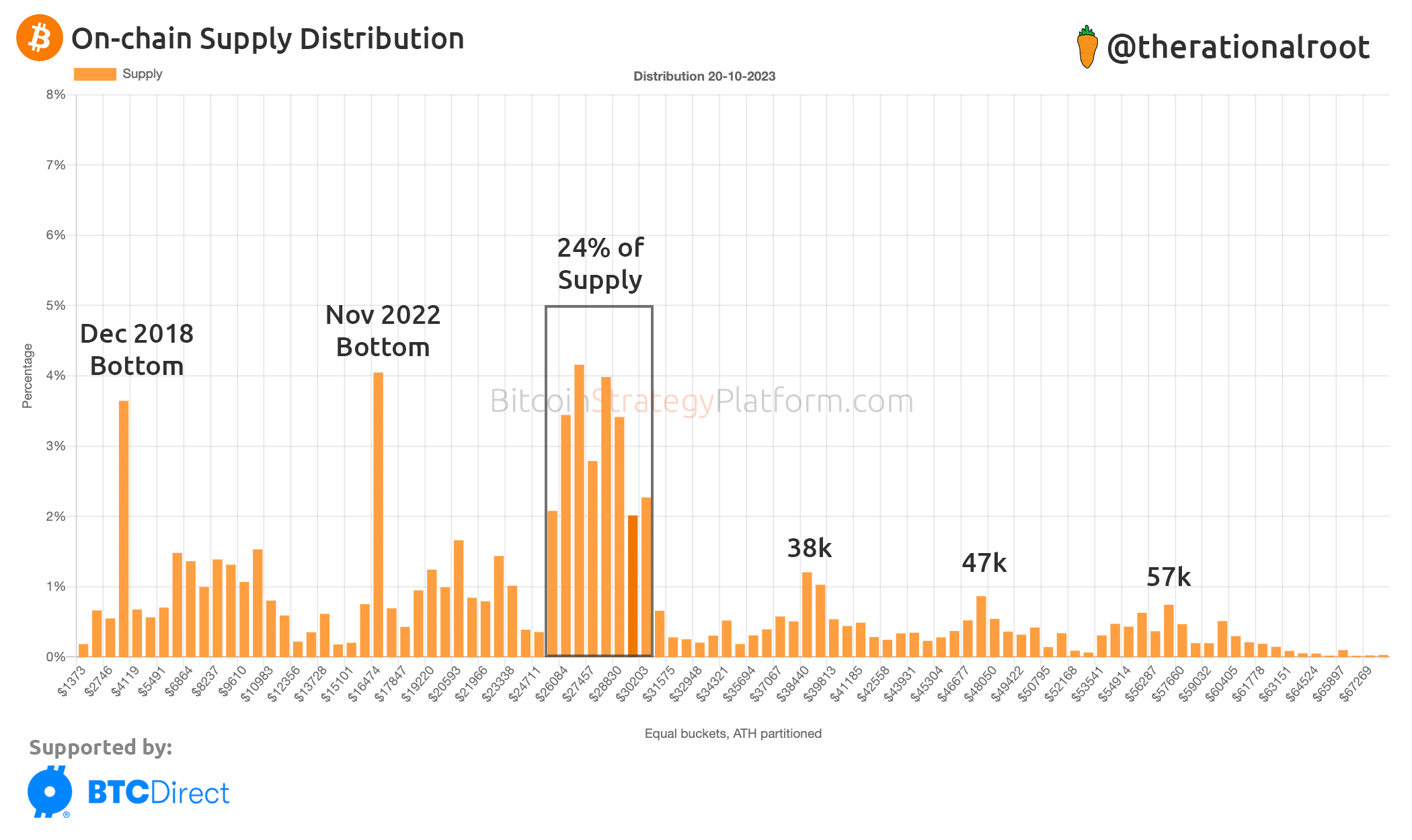
Key Points From the Chart:
We can clearly see the bottoms of the previous cycles.
Around 24% of Bitcoin’s supply has been traded proximate to current price levels.
Our present consolidation is occurring within the 25k – 31k range.
Predominant psychological intervals are apparent at approximately 10k steps: 17k, 28k, 38k, 47k, and 57k. Those seem like key milestones for a lot of buyers.
The distribution is notably bottom-heavy, with a bulk of the supply situated in the chart’s lower half.
Now, for a treat! The upcoming video walks us through how Bitcoin's distribution has changed in the last six months.